Webiny 5.35.0 Changelog
See what's new in Webiny version 5.35.0.
Breaking Changes
Removed the Headless CMS AWS Lambda Function (#2945  )
)
Prior to 5.35.0 version of Webiny, all remote GraphQL API HTTP requests were handled by two separate AWS Lambda functions. One function was responsible for serving the Default GraphQL API (accessible via the /graphql endpoint), while the other was responsible for serving the Headless CMS GraphQL API (accessible via the /cms/{type}/{locale} endpoint).Starting with 5.35.0, all remote GraphQL API HTTP requests are handled by a single AWS Lambda function. In other words, the function is responsible for serving both the Default and Headless CMS GraphQL APIs. Note that the mentioned /graphql and /cms/{type}/{locale} endpoints remain unchanged.
This change will simplify the development and deployment process for the users, and make it much easier to add plugins which interact with the entire system, for example hooking into all the lifecycle hooks Webiny has to offer.
Apart from the usual upgrade guide that’s included with each Webiny release, we’ve also created a separate guide that deals with change in more detail.Singular and Plural Model API Name (#3111  )
)
We’ve added the ability to define the singular and plural model API names for the Headless CMS models.
Before the version 5.35.0, the API name was always created from the modelId property and for the plural, we used pluralize 
From now on, models created via the Admin UI will always need to have singular and plural API name defined, but the models created via the code will have the singular and plural API name only if they’re public (exposed via the GraphQL API).
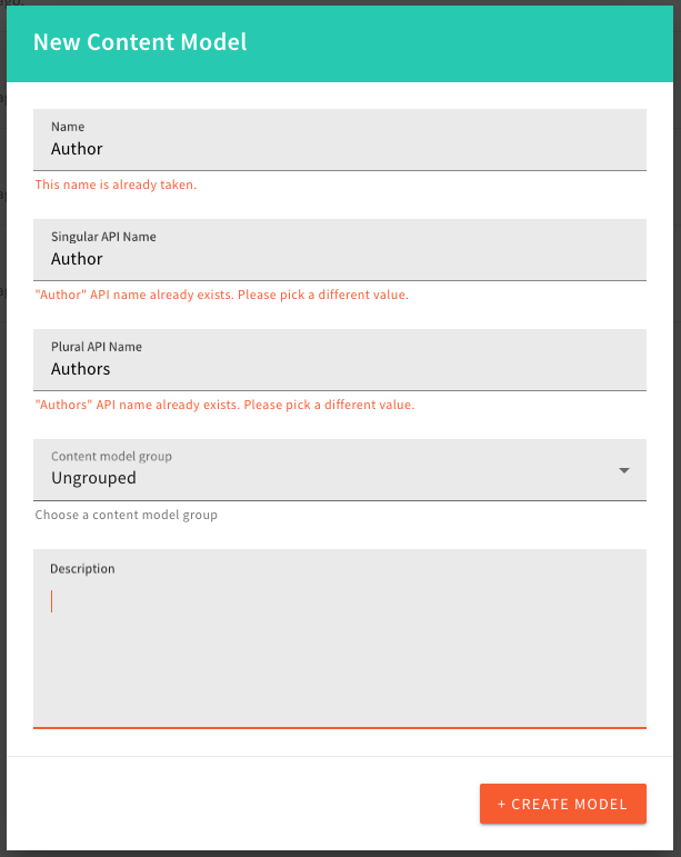 Singular and Plural API Name
modelId property and for the plural, we’ll use
pluralize  library.
List File Tags (#3227  )
)
There was a bug when listing file tags in the DynamoDB + Elasticsearch deployments, where not all tags were returned.
Also, we have upgraded the File Manager listTags GraphQL query to use our standard data, error envelope, and return the tag value and the count value, which represents the number of files that have the tag assigned.
The query now looks like this:
query ListTags {
  fileManager {
    listTags {
      data {
        tag
        count
      }
      error {
        code
        message
        data
      }
    }
  }
}If you are using the listTags GraphQL query directly, you will need to update your code to use the new data, error envelope, as well as the tag and count fields.
createFile Mutation Requires a File Id
With the Support File Aliases feature, file ID is now mandatory when calling createFile GraphQL mutation. If you’ve never used this mutation programmatically, you can ignore this change. But if you have custom scripts interacting with the File Manager, make sure you update them to include all the data returned from getPresignedPostPayload query, if that’s not already the case.
Changed the Location of FileManagerFileTypePlugin Plugin
File Manager supports customization of file types by means of FileManagerFileTypePlugin plugin. This class is now exported from the @webiny/app-file-manager. If you’ve implemented custom file type renderers, make sure you update your import statements.Theme Object Changes
With this release, we’ve made a change in the data structure of the theme object’s styled.typography object. More on this in the Improved Theme’s styled.typography Object section below.
Default Form Layout Replaced
Because of all of the theme object-related changes, and also new improvements that have been introduced to the Form Builder application, note that, during upgrade, your default form layout will be backed up and completely replaced with the latest version of the layout. This means that if you have made any customizations to the default form layout, you will need to manually re-apply them to the new layout.Headless CMS
Headless CMS GraphQL Schema Plugin (#2945  )
)
As a part of the Removing the Headless CMS AWS Lambda Function task, there is a new GraphQL Schema plugin which is responsible for the Headless CMS GraphQL schema.
If you were using the GraphQLSchemaPlugin to define your custom schema for the Headless CMS, please replace it with the CmsGraphQLSchemaPlugin.
Detailed (Advanced) Admin UI Reference Field (#2969  )
)
We added a new reference field renderer, called Detailed view with modal search. The Detailed renderer is now a default renderer for all the new reference fields, but users can switch to the old one whenever they want to - or from the old one to the new one.
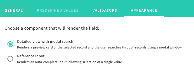 Model Field Appearance Tab
 List of referenced Items
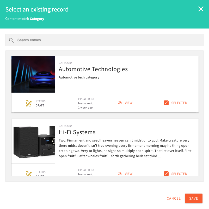 Modal Search of References
 Multiple Model Reference Field
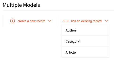 Multiple Model Reference Field Model Choice Dropdown
Default Model Fields (#2977  #2978
#2978  )
)
We added the ability create a new model with the default fields defined. Default fields are:
- Title (title) - text field
- Description (description) - long text
- Image (image) - file field with images only
By the default, the checkbox defining the default fields creation is checked, but users can uncheck it if they do not want to create the default fields.
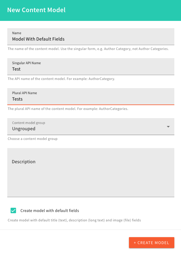 Model With Default Fields Checkbox
Model Icon (#3142  )
)
We’ve introduced the ability to add an icon when creating or editing a content model. Within the Admin app, an icon picker will be shown when creating or editing content models. For models defined via code, users will need to type in the icon pack identifier and the icon identifier, in form of packId/iconId. For example, a newspaper icon is fas/newspaper.We have a few icon packs by default: @fortawesome/free-brands-svg-icons (fab), @fortawesome/free-solid-svg-icons (fas) and @fortawesome/free-regular-svg-icons (far).
Disable Dynamic Zone in the Object Field (#3160  )
)
We disabled the possibility to add the Dynamic Zone field into the Object field. Unfortunately, we were forced to do this for the moment, as we need to implement structural changes in the Headless CMS for this to work properly. This is something we’ll enable in the future, but for the time being, to prevent unexpected situations and problems with the models, you will only be able to use the dynamic zone field as a top-level model field.
GraphQL Schema Types CmsCreatedBy and CmsOwnedBy Replaced With CmsIdentity (#2969  )
)
As part of the advanced reference field PR, we removed the GraphQL types CmsCreatedBy and CmsOwnedBy in favor of the CmsIdentity type, because they represented the same data.
GraphQL Schema Cache (#3201  )
)
When the user project did not contain any models in the database (created via the UI), GraphQL Schema cache did not work properly as the generated cache key was faulty. We now generate a correct key, which is used to cache the GraphQL Schema until the next model change, or next deployment of the code.
Code Content Model Without Validation (#3187  )
)
The projects, which have a lot of the CMS Models created via the code, can get a slow API response due to the validation ran on every request.
This PR introduces noValidate property on the CmsModelPlugin 
When using the noValidate flag, users will must be extremely careful as we do not check anything they set in that code model.
Benchmark Measurement Points (#3185  )
)
After adding the Benchmark tool to our system, we added some benchmark points to the Headless CMS.
This allows us, and our users, to figure out bottlenecks during the request, if there are any. Benchmark measurement points cover the GraphQL Schema generation and processing of the request body, at the top level. The measurements cover all our CMS GraphQL Queries and Mutations, as well as the request body processing step.
Page Builder
Introducing Page Templates (#2963  #3086
#3086  )
)
Prior to this release, upon creating pages with the Page Builder application, users would always start with a blank page.
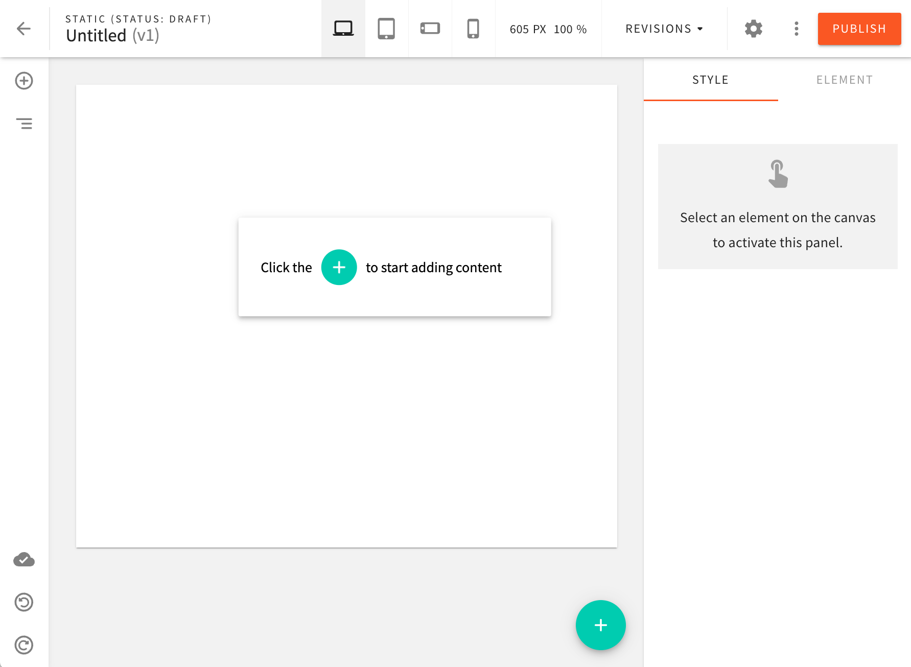 Blank Page
For some users, this can be challenging, as it can be hard to get inspiration on how to structure content correctly. In addition to this, websites are often built in a way that pages follow a set of predefined structures. In other words, all product pages look the same, all blog pages look the same, and similar.
In order to tackle this problem, we are introducing a brand new feature called Page Templates!
Via the dedicated templates editor, users can now create page templates that can be used to create new pages.
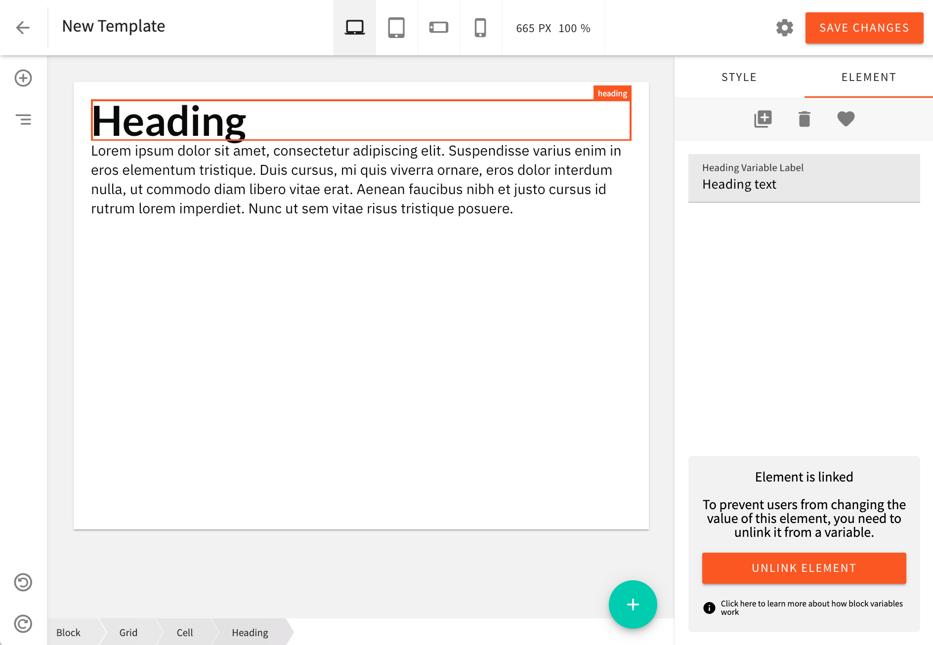 Templates Editor
In a nutshell, the idea is that a page template behaves similarly to a block. A user picks a template, that is inserted into the page editor. A user can only populate variables that the template exposes, or the user can “unlink” the template, which allows them to rearrange elements, add new elements and remove existing elements.
We’re excited about this new feature, and we hope you’ll find it useful as well! Start creating your own page templates today and let us know what you think! We’d love to hear your feedback!
Introducing a Brand New Text Editor (#3147  )
)
With this release, we’re introducing a brand new text editor that will make it even easier to create content-rich pages, blocks, and templates!
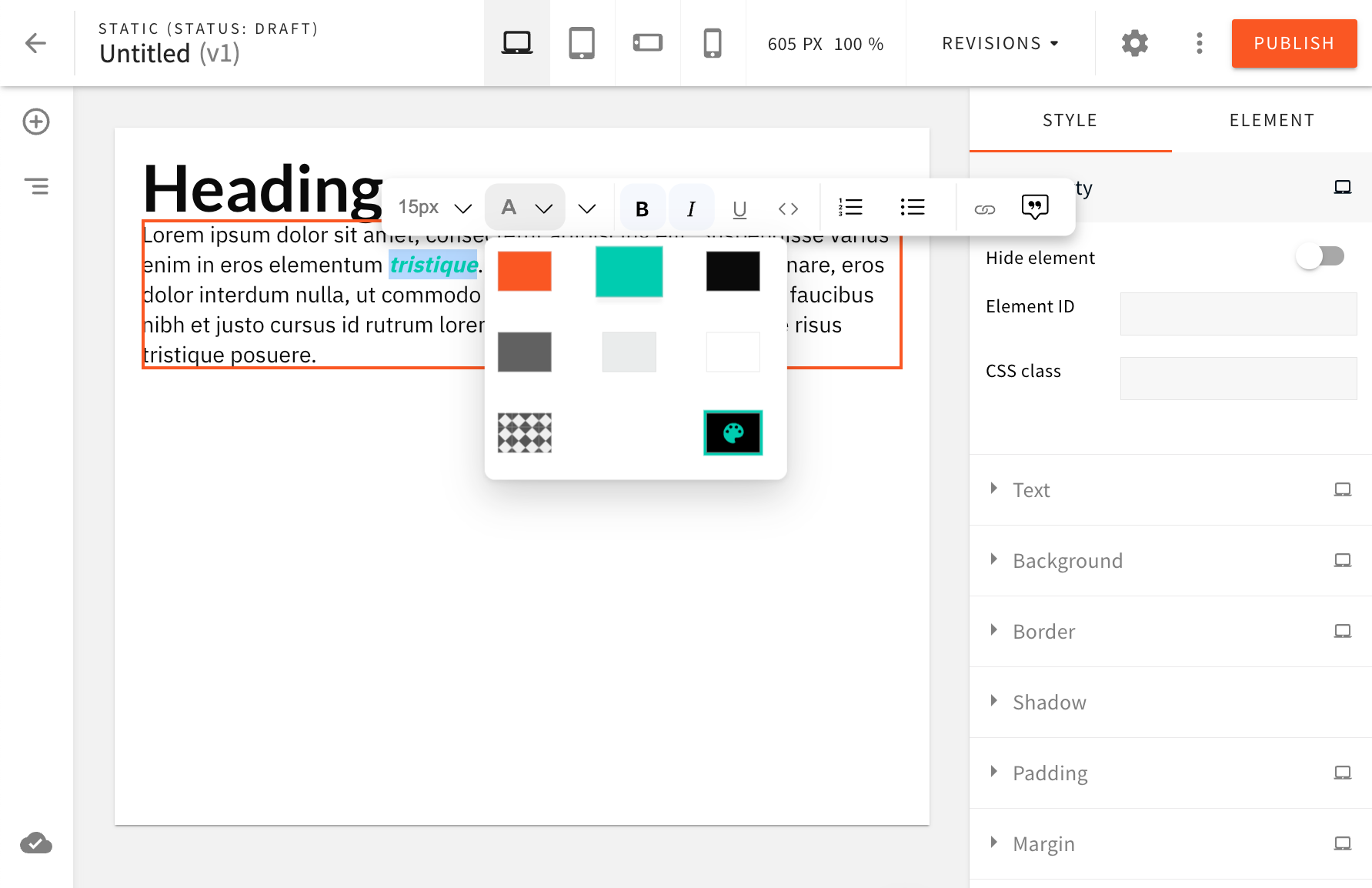 Introducing A Brand New Text Editor
The new text editor is based on the Lexical 
In terms of backwards compatibility, we’ve made sure that texts created with the old editor continues to work as usual (the old editor will still be used). Only the new texts will be using the new editor.
We hope you’ll enjoy using the new editor! This is the first release of the new editor, and we’re still working on adding new features and improving the overall experience. We have a lot of exciting things planned for the future, so stay tuned!
Introducing Advanced Content Organization for Page Builder
The Advanced Content Organization (ACO) for Page Builder is a new feature that provides users with the ability to organize content in an effective, easy-to-manage way. The ACO allows users to add pages in separate folders and rearrange content as needed, making it easier to find what they are looking for.
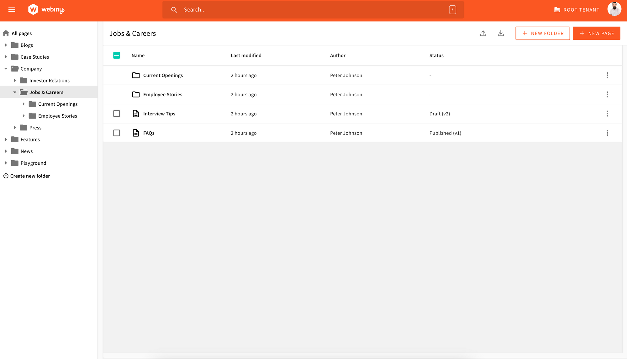 Advanced Content Organization for Page Builder Overview
With the new Page Builder pages list users can:
- Create and update a multi-level folder structure.
- Sort both folders and pages based on “Name” and “Last Modified Date”. This feature makes it easier for users to find specific pages and folders quickly.
- Move a page across the hierarchy tree, and it has no impact on the page URL. The two have been decoupled to ensure users have the flexibility they need without having a negative impact on SEO if they decide to restructure their folder/page organization.
In future releases, we are planning to expose public APIs to allow developers to customize the table view, so they can include, modify or remove columns.
Multiple UI Improvements
Webiny’s Page Builder application has been improved with a new batch of UI improvements.
Exporting Blocks From Current Category (#3109  )
)
For starters, upon exporting blocks, users can now choose whether they want to only export blocks that belong to the currently selected category of blocks.
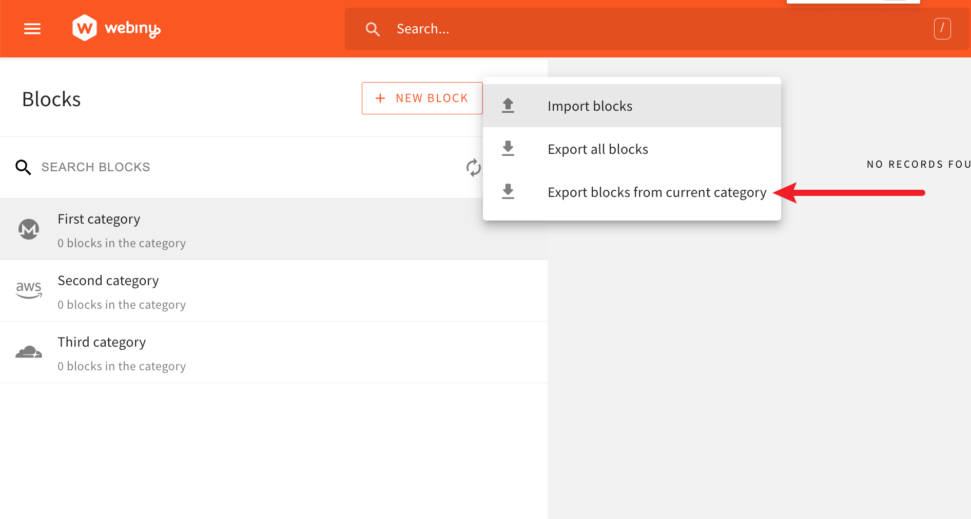 Exporting Blocks From Current Category
Improved Searching of Blocks (#2968  )
)
From now on, typing into the SEARCH BLOCKS search field will perform a search across all block categories, where the UI will respond in the following way.
In the list of block categories (left side), it will filter out categories that don’t contain at least one block whose name is matched by the search query. Once a category is clicked, in the list of blocks (right side), only matched blocks will be listed.
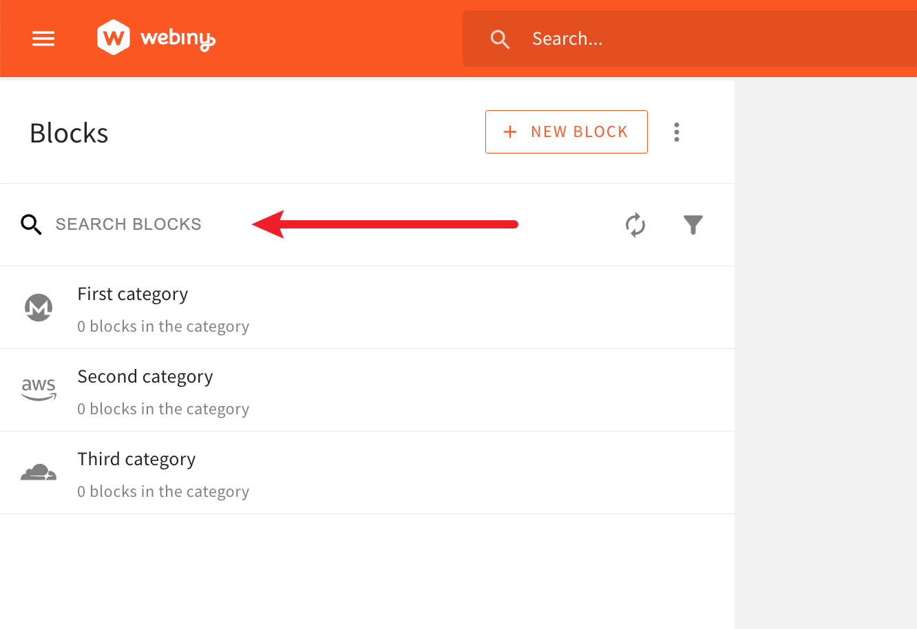 Improved Searching of Blocks
Improved Sorting of Block Categories (#3099  )
)
Prior to this release, across different screens within the Admin application, we’ve had different default sorting applied when listing block categories.
For consistency sakes, by default, every list of block categories across different screens within the Admin application will now be sorted alphabetically. User can then apply a different sort, if need be.
Multiple Smaller Blocks-Related UI Improvements (#3106  )
)
The following are some smaller, but still useful, blocks-related UI improvements we’ve made.
Edit Block Button
In the page editor, once a block has been selected on the page canvas, in the right sidebar, the newly added Edit button enables users to quickly open the block in the block editor and make necessary changes to it.
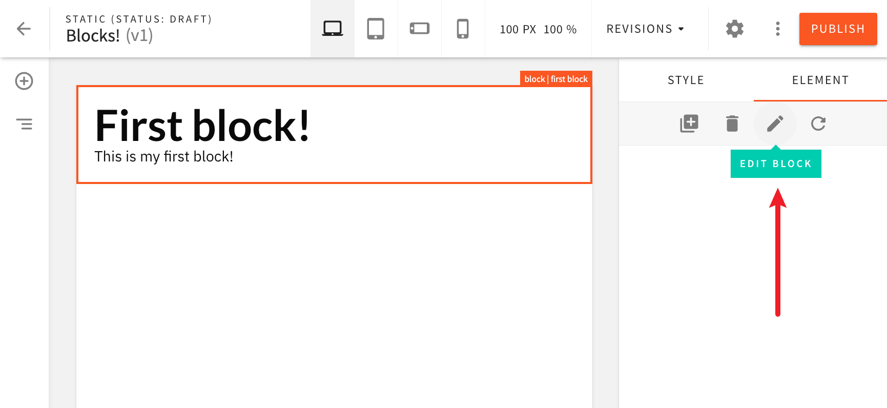 Edit Block Button
Refresh Block Button
With the Edit button, we’ve also introduced the Refresh button. As the name suggests, once clicked, the selected block will be refreshed, reflecting changes that may have been done to the block by the user potentially in a separate browser tab, or by other user.
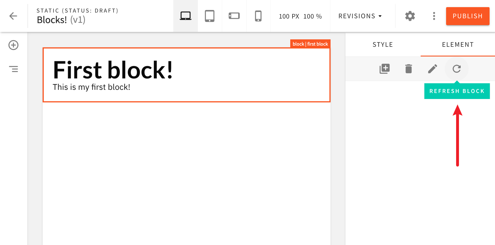 Refresh Block Button
Block Name Displayed In the Page Editor
When a block is selected on the page canvas, the name of the block will be displayed in the top-right corner, making it easier for users to identify blocks on the page.
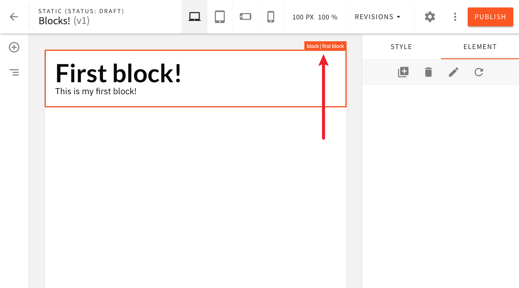 Block Name Displayed In the Page Editor
Refresh List of Blocks Button
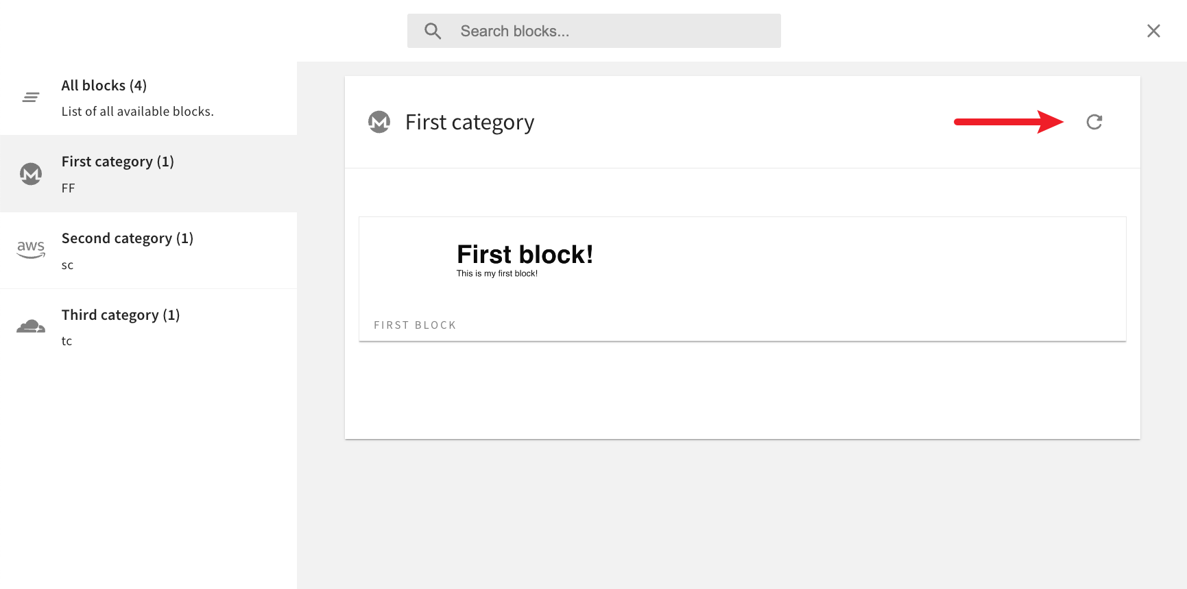 Refresh List of Blocks Button
Previewing Pages From Revisions List Now Works Correctly (#3103  )
)
In the page revisions lists, clicking on the Preview link would in certain cases incorrectly redirect users to the public website, instead of page’s preview URL.
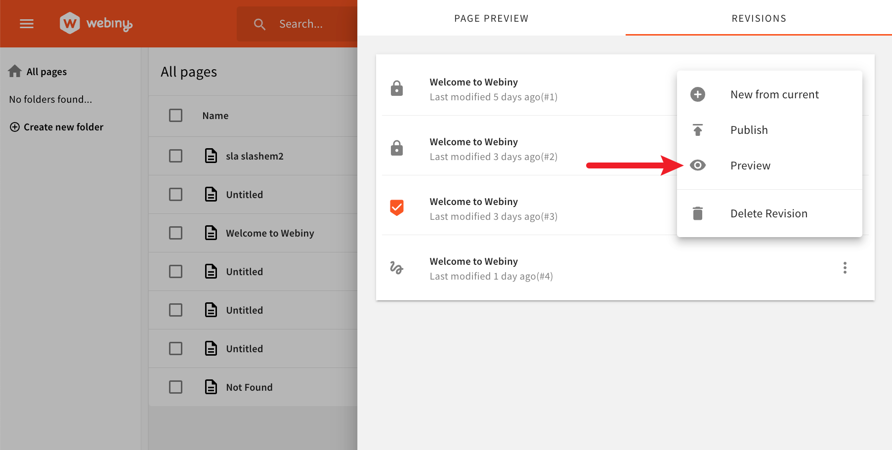 Previewing Pages From Revisions List Now Works Correctly
This has now been taken care of. Clicking on the link will correctly redirect the user to page’s preview URL.
Fixed Highlighting of Active Page Elements in Page Editor (#3152  )
)
In the page editor, when clicking on some page elements like Image and Form, orange borders that surround the element would not be rendered correctly.
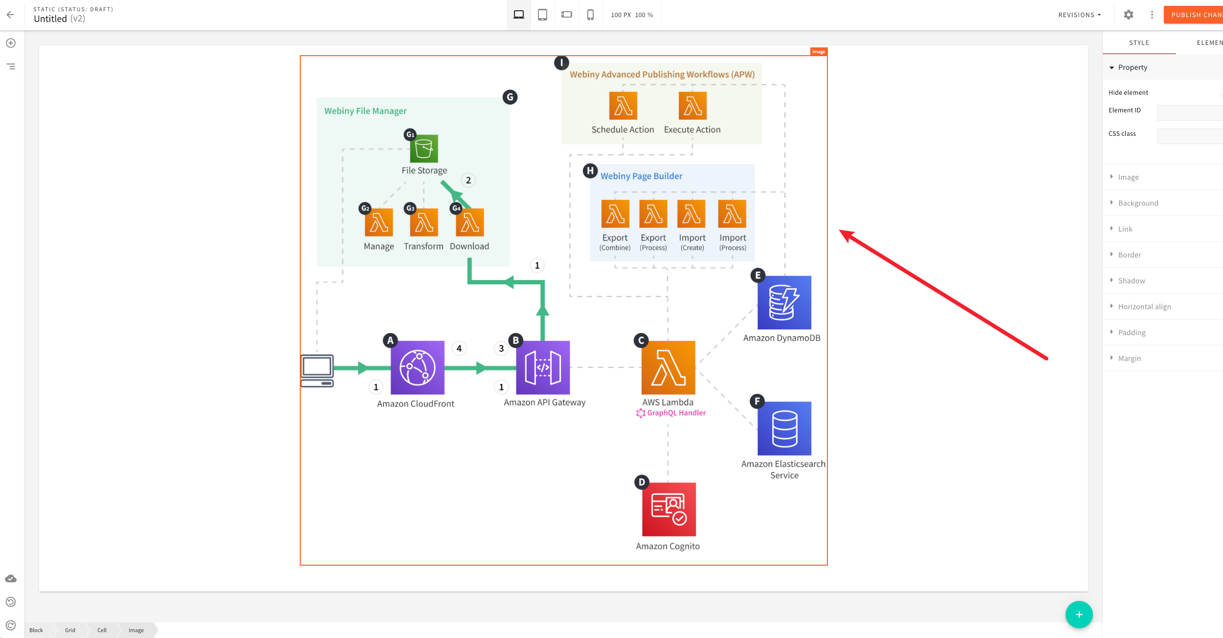 Fixed Highlighting Of Active Page Elements In Page Editor
This has now been addressed. The orange borders should be rendered correctly for all page elements.
Trimming of Trailing Slash in Page Path (#3153  )
)
In the page editor, in page’s general settings, providing a page path that ends with a forward slash would break background page rendering which happens once the page has been published.
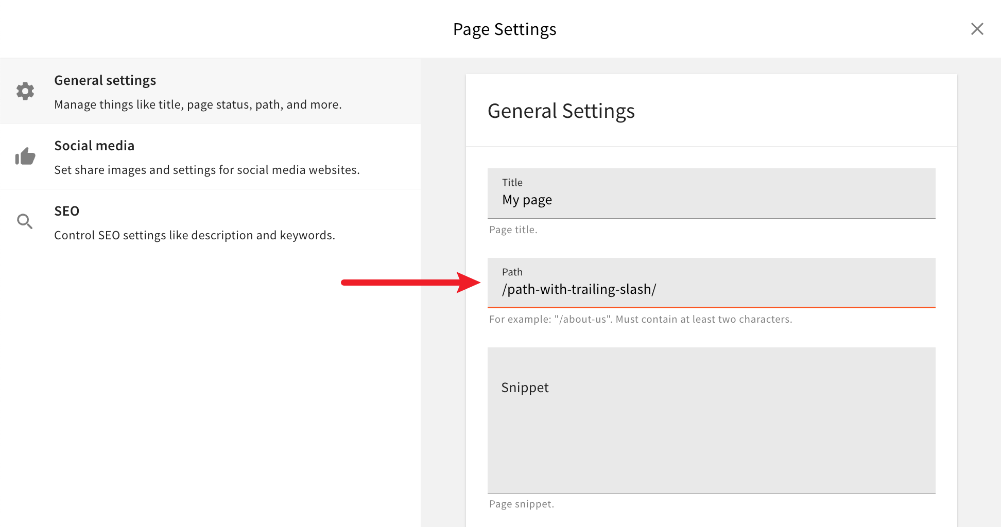 Trimming of Trailing Slash In Page Path
From now on, trailing slashes in page path will be removed, ensuring the page gets rendered correctly once published.
Using SEO Title Instead of General Settings Title (#3155  )
)
From now on, the title specified in the SEO settings section will be used as the title for published pages (title set via the <title> 
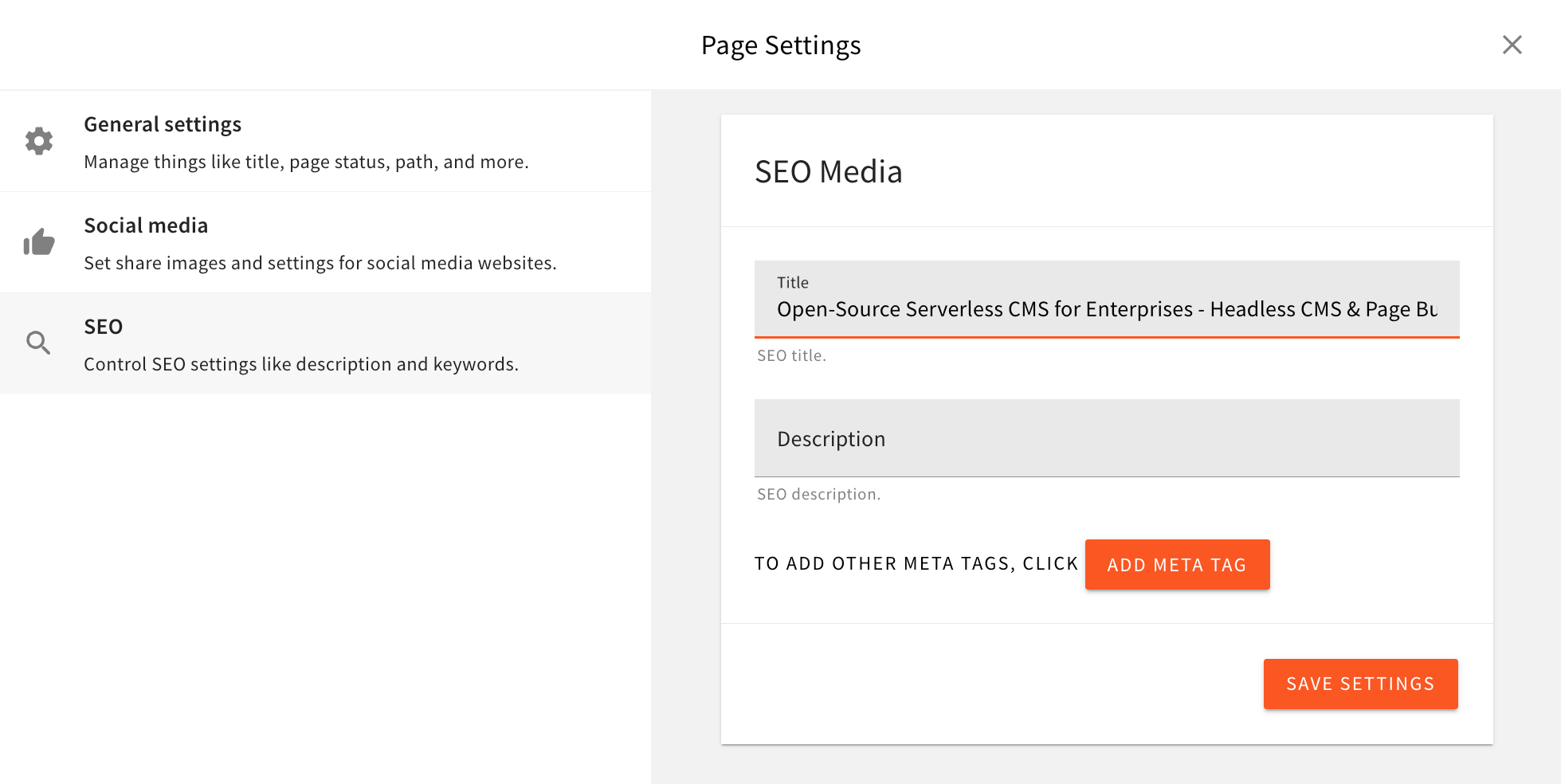 Using SEO Title Instead Of General Settings Title
Previously, the title specified via the General settings would be used instead, which, often, we’ve seen it’s not something users would expect.
Improved Grid and Cell Page Elements (#3012  )
)
Grid page element now provides users with a couple of new features in page element settings.
For starters, users can now choose the number of rows for the grid, enabling them to quickly have multiple rows of columns, and not just one.
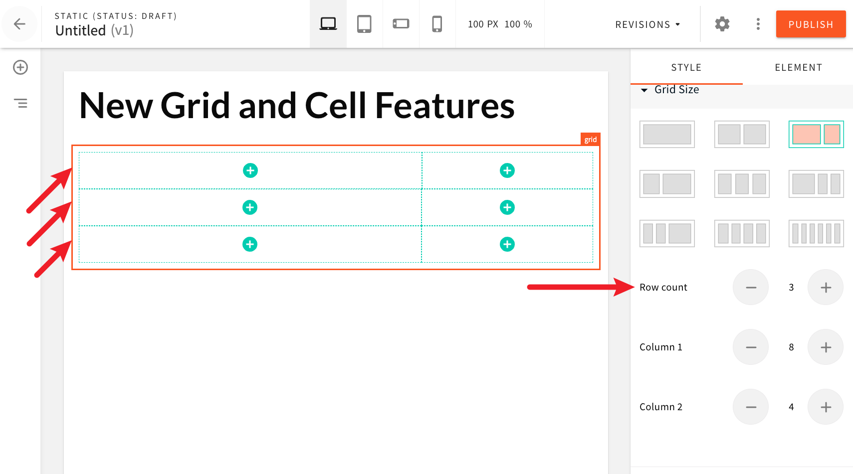 Grids With Multiple Rows
And with the new Column gap and Row gap settings, users can add spacing between grids and cells:
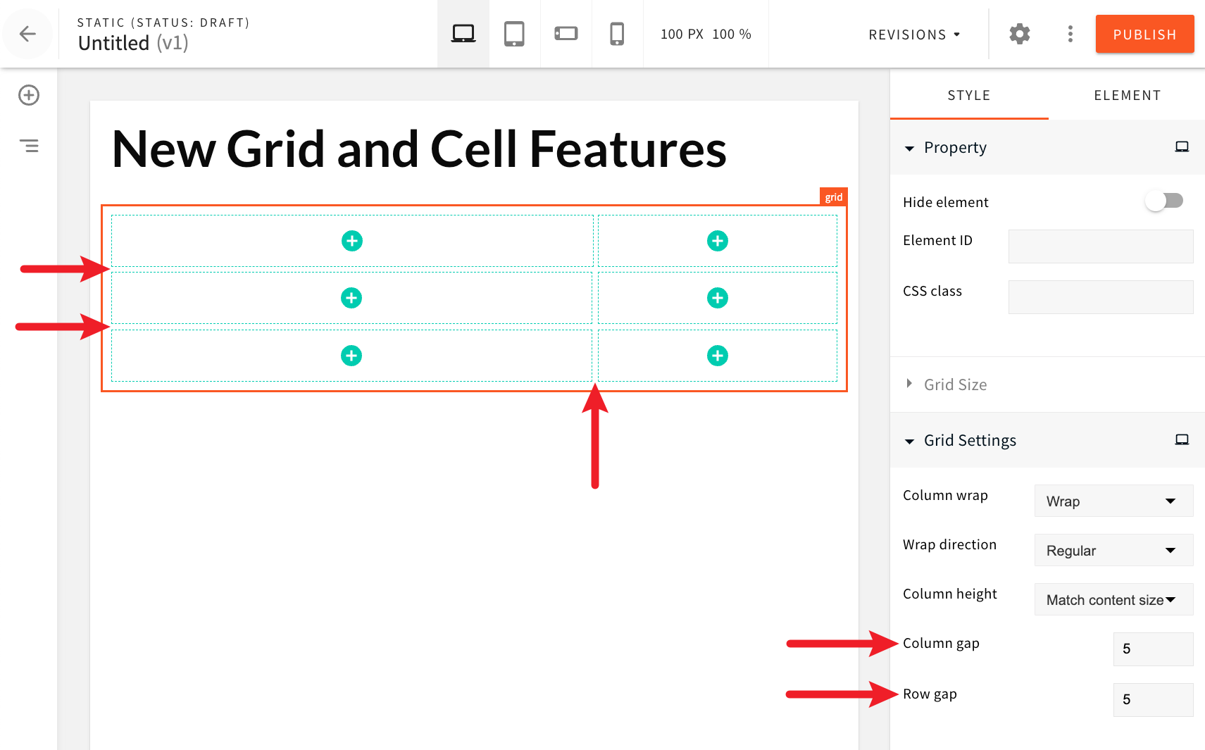 Column and Row gap settings
Furthermore, grid cells can now be vertically expanded and take the full height of the parent grid via the new Column height setting.
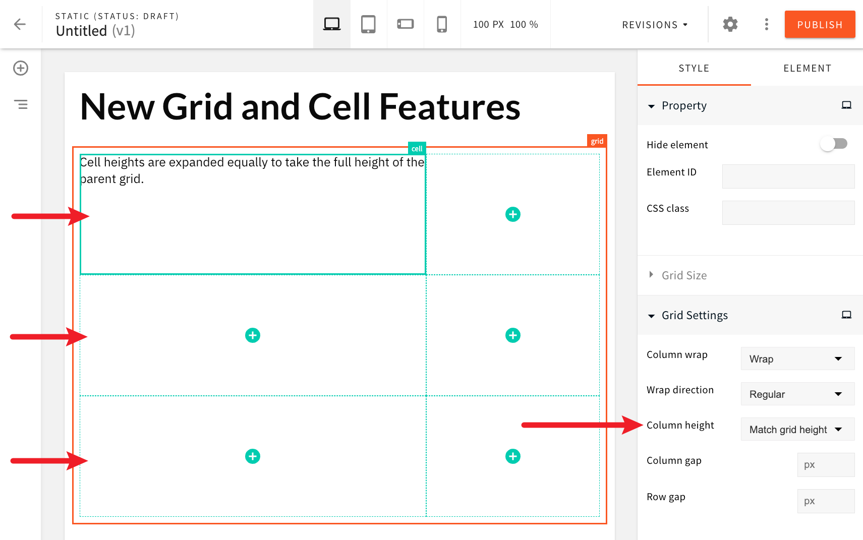 Grid Cells Vertically Expanded
Finally, users can now apply vertical centering of content placed in grid cells.
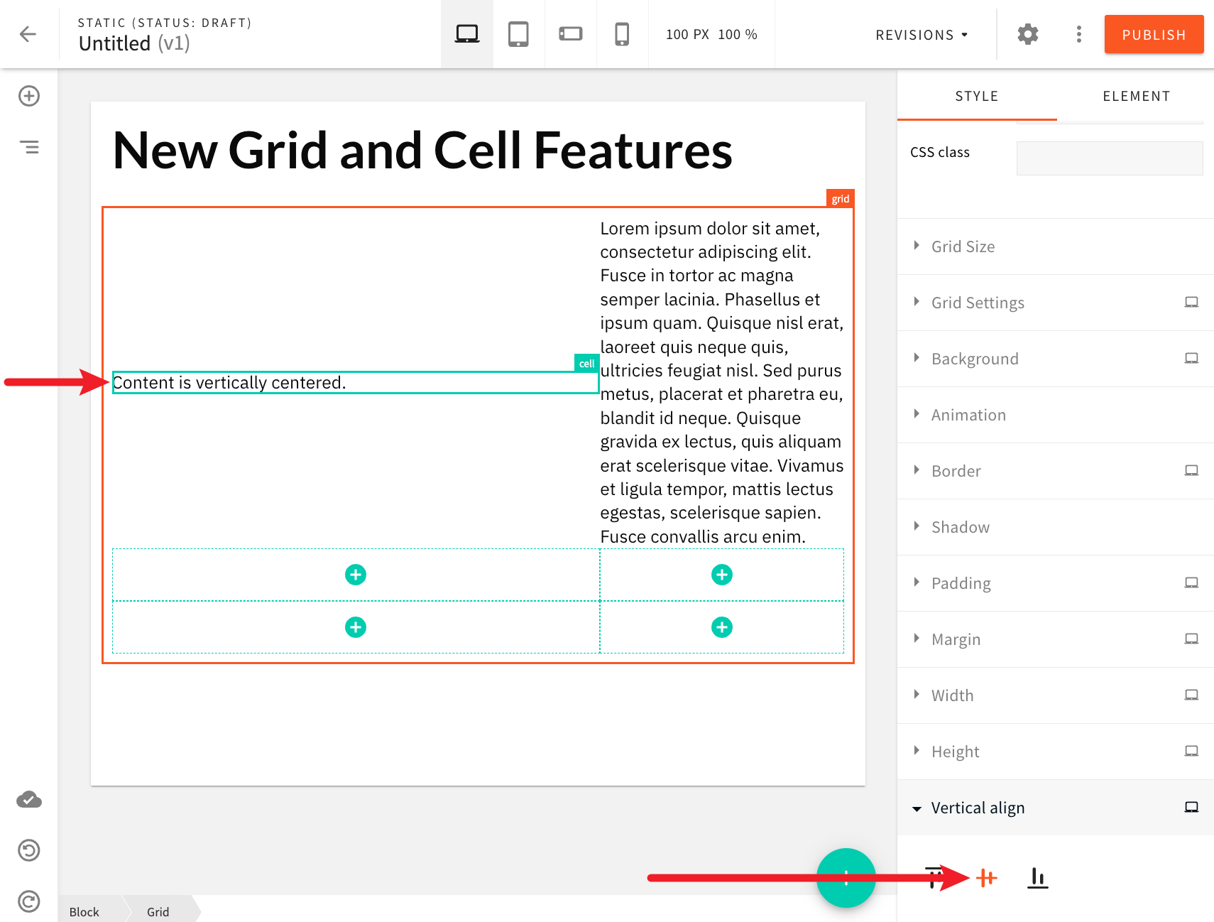 Vertical Centering Grid Cells Vertically Expanded
Improved Theme's styled.typography Object (#3147  )
)
Prior to this release, within the theme object, the styles.typography property referenced an object where keys represented the typography variant (heading1, heading2, etc.), and values were objects representing the actual typography styles.
From now on, the styles.typography property references an object where keys represent the typography type (heading, paragraph, etc.), and values are arrays of objects, where each object represents a specific typography variant. Each typography variant is an object that consists of four properties: id, name, tag, and styles. For example:
{
  // ...
  styles: {
    typography: {
      heading: [
        {
          id: "heading1",
          name: "Heading 1",
          tag: "h1",
          styles: {
            // ...
          }
        },
        {
          id: "heading2",
          name: "Heading 2",
          tag: "h2",
          styles: {
            // ...
          }
        },
        // ...
      ],
      paragraph: [
        {
          id: "paragraph1",
          name: "Paragraph 1",
          tag: "p",
          styles: {
            // ...
          }
        },
        {
          id: "paragraph2",
          name: "Paragraph 2",
          tag: "p",
          styles: {
            // ...
          }
        },
        // ...
      ],
      // ...
    }
  }
}Theme Object Now Available in Emotion Styled Components (#3141  )
)
Prior to this release, if users wanted to use Emotion styled components 


With this release, the theme will internally be loaded into Emotion’s ThemeProvider, meaning it will be available in your custom Emotion styled components.
The following is an example of an Emotion styled component that uses the theme object:
export const HeroSectionWithTheme = styled.div(({ theme }) => ({
  lineHeight: "125%",
  backgroundColor: theme.styles.colors.color1,
  backgroundRepeat: "no-repeat"
}));Custom Responsive Emotion Styled Components Are Now Rendered Correctly in the Page Editor (#3141  )
)
Prior to this release, if users wanted to use Emotion styled components 


With this release, your custom responsive Emotion styled components should be rendered the same both on the public website and in the page editor.
Ensuring responsive design works on both public website and in the page editor was achieved via the @container CSS at-rule 
@media queries defined in the theme 
@container pb-page-canvas rules.
Introduced mq Utility Function for Easier Styling (#3141  )
)
One of the tools that is recommended in Emotion 

import { css } from "emotion";
import facepaint from "facepaint";

const mq = facepaint([
  "@media(min-width: 420px)",
  "@media(min-width: 920px)",
  "@media(min-width: 1120px)"
]);

const myClassName = css(
  mq({
    color: ["red", "green", "blue", "darkorchid"]
  })
);
With this release, we’ve decided to include this library in the @webiny/app-page-builder-elements 
mq utility function, users can immediately start writing their per-breakpoint styles, because the function is already configured to follow the breakpoints defined in the theme 
import React from "react";
import { mq } from "@webiny/app-page-builder-elements";
import styled from "@emotion/styled";

// Basic usage.
export const HeroSection = styled("div")(() =>
  mq({ color: ["red", "green", "blue", "gray", "white"] })
);

// With theme being accessed via the `theme` argument:
export const HeroSectionWithTheme = styled("div")(
  {
    lineHeight: "125%",
    backgroundColor: "#fff",
    backgroundRepeat: "no-repeat"
  },
  ({ theme }) =>
    mq({
      color: [
        "red",
        theme.styles.colors.color1,
        theme.styles.colors.color2,
        theme.styles.colors.color3,
        theme.styles.colors.color4
      ]
    })
);Input Validation With Zod Library (#3167  ) (#3194
  )
)
We replaced the Commodo validation (our custom package) with the Zod library 
Title and Path Maximum Length (#3188  )
)
The Page Builder title and path properties are now set to be maximum of 500 characters.
Website - Clicking on Links No Longer Does a Full Page Refresh (#3215  )
)
Prior to this release, clicking on links rendered by Pages List, Button, and Image page elements would cause a full page refresh, making the UX for the website visitor not as good as it should be.
This has now been addressed. Clicking on links rendered by these page elements will cause the following page to be rendered immediately, without a page refresh happening.
Website - Added Missing Tenant Error Message (#3202  )
)
Prior to this release, if a user would open their website application in local development and their Webiny project had multi-tenancy feature enabled, then they would just see a blank screen in case the tenant ID hasn’t been set previously. No errors would be shown in the browser console too.
Additional point of pain would be the fact that setting the tenant ID is also something that was not clear and, in almost all cases, would left users further confused.
To address this, we’ve added better error reporting and ensured users are aware what are the next steps. The following is the error message that will be shown to users in their browser:
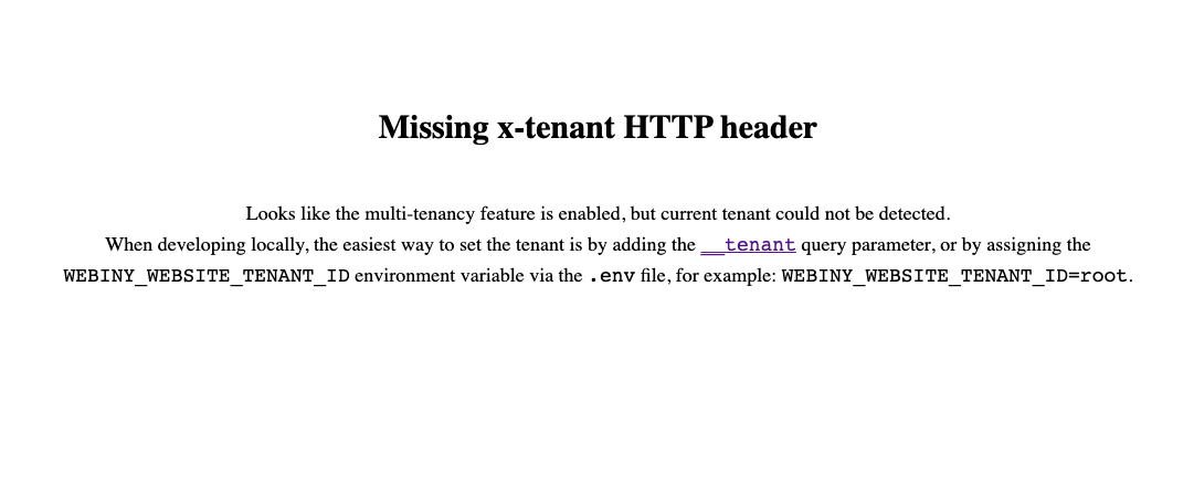 Website - Added Missing Tenant Error Message
Page Editor - Addressed Canvas Width Indicator Issue (#3216  )
)
The canvas width indicator displays the width of the canvas, which changes depending on the selected breakpoint (desktop, tablet, mobile-landscape, mobile-portrait). Due to an internal bug, the indicator would always report 100px as the width, which was incorrect.
This has now been addressed, so the actual canvas width should now be displayed correctly.
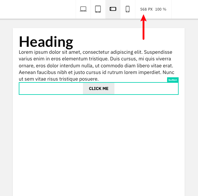 Page Editor - Canvas Width Indicator Now Works Correctly
Form Builder
Introduced E-Mail Triggers (#2957  )
)
 E-mail - Submission Notification
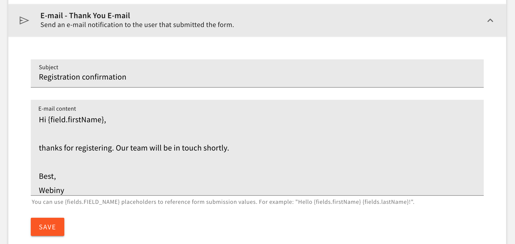 E-mail - Thank You E-mail
Under the Form Builder triggers you’ll now find two new options. The “E-mail - Submission Notification” trigger sends an email every time a form submission is received. This way it’s much easier to stay updated when someone submits one of your forms.
The “E-mail - Thank You E-mail” trigger sends an email to the user who submitted the form. Inside the email content, you can use the {fields.FIELD_NAME} variable to display the form submission data, adding personalization to your emails.
Added the Ability to Import/export Forms (#3077  )
)
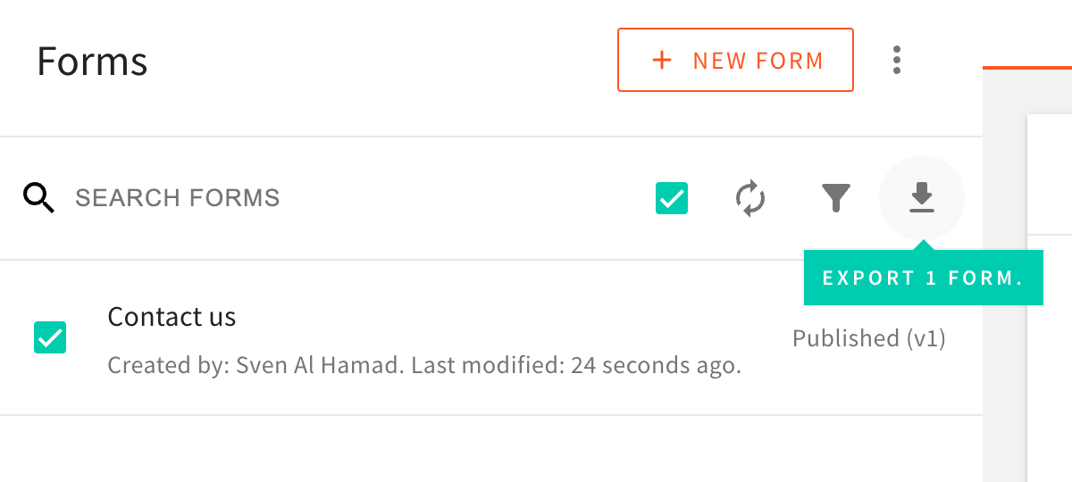 Form Builder - Export form
We’ve added the ability to export selected forms from the system and easily import them into another system. This way, you can easily move your forms from one environment to another.
Improved Export of Submissions (#3093  #2965
#2965  )
)
We made several updates to the way form submissions are exported. Firstly, the exported CSV file will now contain the exact date and time (UTC) when the submission was created. Secondly, the export format has been improved to make it easier to read. Fields like the checkbox and radio button that previously contained the field value instead of the label, making it hard to read, have been fixed.
Introduced Copy Form Submission to Clipboard (#2952  )
)
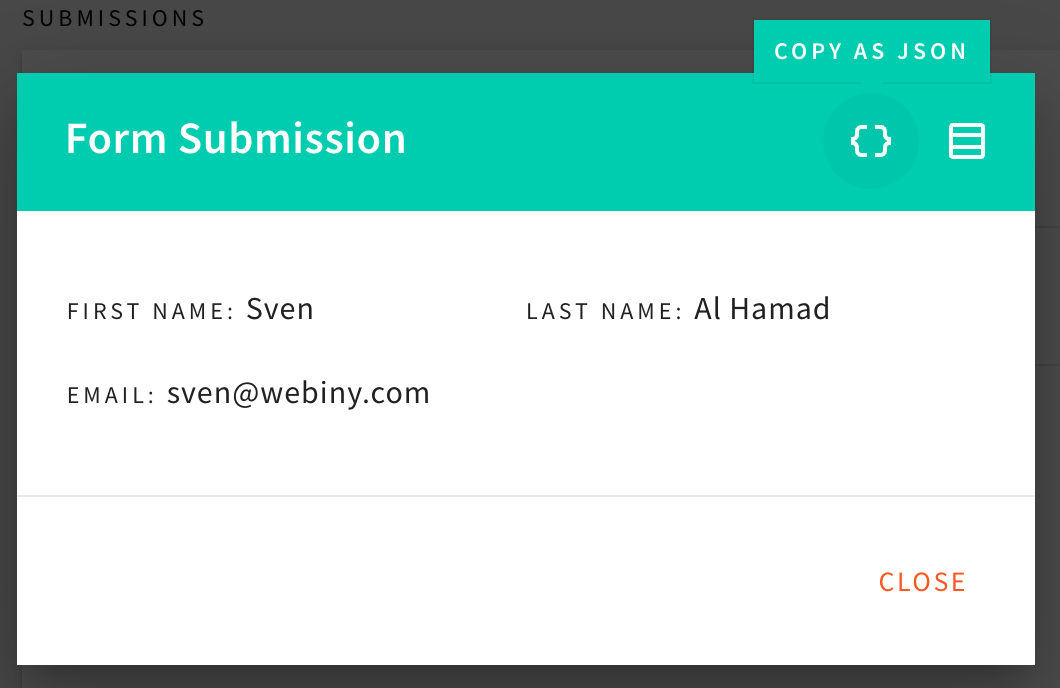 Form Builder - Copy submission
When you preview the submission details in the modal dialog you’ll notice two new buttons in the top right corner. The “Copy as JSON” and “Copy as CSV” buttons will copy the submission data to your clipboard, so you can easily paste it into another application.
Ability to Have "Other" Option (#3031  )
)
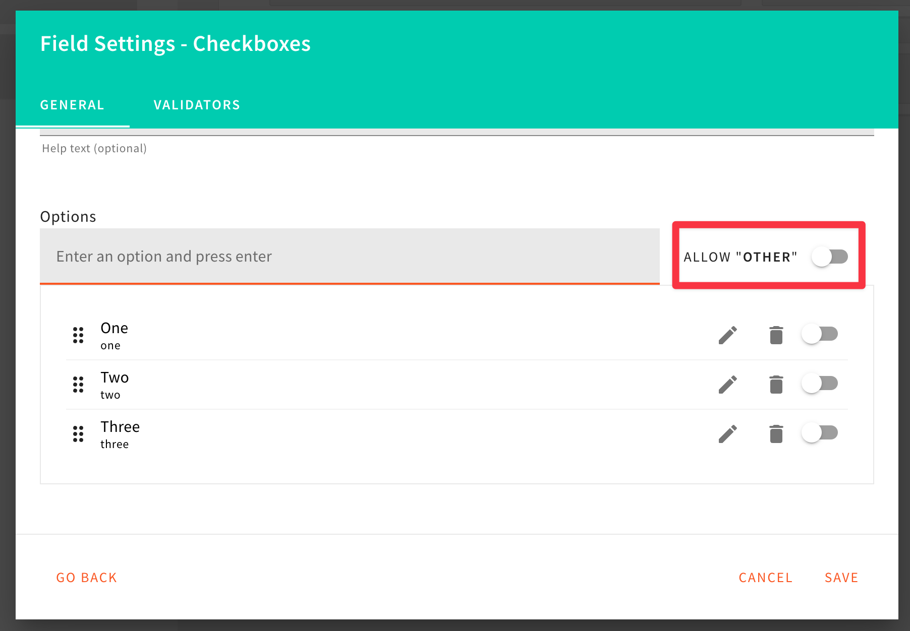 Form Builder - Other settings
 Form Builder - Other preview
We’ve added the ability to have an “Other” option in the radio button and checkbox fields. This way, you can easily allow users to add a custom value to the field.
Multiple Improvements on the Default Form Layout (#3009  #2950
#2950  #2964
#2964  )
)
We’ve made several improvements to the default form layout. The most notable ones are:
 Form Builder - Required toggle
You can now view and toggle the required indicator on and off directly from the form layout editor.
 Form Builder - Required indicator
Previously the required fields didn’t have any indicator on them to show that they are required. We’ve added a red asterisk to the field label to make it clear that the field is required.
 Form Builder - Help text
The position of the field help text has now been moved under the title to make it easier to read.
Added Basic Form Field ID Validation (#3017  )
)
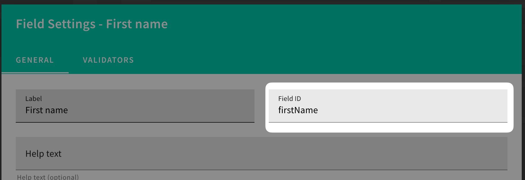 Form Builder - Field ID Validator
We’ve added a basic validation to the form field ID. Previously, you could enter any value as the field ID, which could cause different issues in the system. Now, you can only enter letters, numbers, and underscores.
Security
Cognito Custom ID Attribute (#3090  )
)
Cognito User Pools will now have a new custom attribute custom:id containing a unique identity ID generated by Webiny. This will allow developers to export users from Cognito User Pools and maintain the identity IDs when importing those users into new User Pools.
By default, Cognito generates a sub attribute, which we used as a unique identifier for the user. That, however, poses a problem with backups and restoration, since AWS generates new values for the sub attribute upon importing the user into the user pool. To abstract Webiny away from this problem, from now on, we will generate our own unique identifier, and store it as a custom:id attribute, and use that to map Cognito identities to Webiny.
This change is backwards compatible; all existing identities will use the sub attribute, and the new ones will also have the new custom:id attribute generated.
Cognito Custom Authorization Logic (#3054  )
)
You can now reuse our default Cognito security package to implement custom authentication and authorization logic, without using the low level API. This gives you the ability to create protected user areas on your websites, etc.
See a full working example in the following repo: https://github.com/webiny/webiny-examples/blob/master/gated-content/packages/api/src/createWebsiteSecurity.ts
Security withoutAuthorization Method (#3176  )
)
There is now a withoutAuthorization method on the context.security object. It is intended to replace the context.security.disableAuthorization() and context.security.enableAuthorization() methods.
The problem with these legacy methods is that they explicitly enable/disable authorization without any checks, or execution context awareness. In some situations, this caused authorization to be enabled when it shouldn’t, and code would start throwing authorization errors.
The new security.withoutAuthorization() method keeps track of the current state of authorization, and will not re-enable authorization if it was already disabled when the execution cycle started.
The following code demonstrates how you can use the new method, and have full TS support:
const result = await context.security.withoutAuthorization(async () => {
  const params = {
    myParam: 1,
    anotherParam: 2
  };
  return userCustomCodeCallWhichNeedsToHaveAuthorizationDisabled(params);
});
Tenant Tags (#3136  )
)
We’ve introduced a new tags field on tenants, to allow various use-cases to be implemented programmatically. Tags can be very useful when filtering tenants, or applying conditional logic, like data propagation, etc.
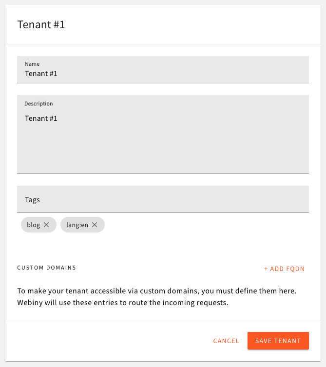 Tenant Tags
File Manager
Support File Aliases (#3096  )
)
File Manager now supports file aliases. This means that you can specify one or more aliases on each file, and our File Manager will be able to route the request to the actual file in our S3 bucket. This is useful when migrating files from other systems, when you need to preserve the URLs in your existing content. Internally, files are still stored to the S3 bucket following Webiny path structure.
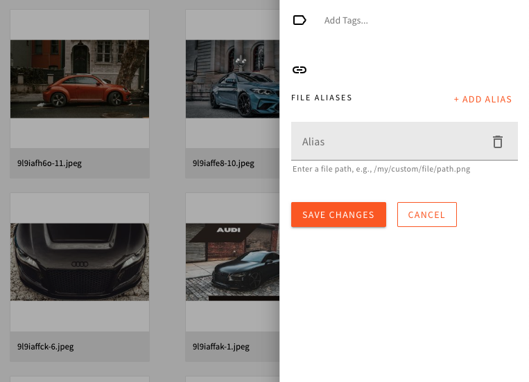 File Aliases
With this, we’ve also improved the way we store files into the bucket. We now have a unique ID for every file, which is used as a folder name, and all file related content (resized images, transformed images, etc.) is stored within that folder. This simplifies file management, cleanup, and gives us a home folder for every file, where we can store additional things related to the file.
Lifecycle Events (#3120  )
)
File Manager context now exposes lifecycle events, as any other Webiny app. You can now programmatically hook into file’s life cycle, and do various things with single files, as well as with batches of files.
See an example of some events exposed:
new ContextPlugin<FileManagerContext>(async context => {
  context.fileManager.onFileBeforeCreate.subscribe(async params => {
    console.log("I'm about to create a file!");
  });
  context.fileManager.onFileAfterCreate.subscribe(async params => {
    console.log("I've created a file!");
  });
});
File DB Storage Improvements (#3083  )
)
Some users are pushing Webiny to its limits with the amount of files they’re uploading into the system (counted in millions). For this reason, we’ve introduced some improvements on the primary key and global secondary indexes of file records in the DynamoDB table, to eliminate the possibility of having hot partitions.
This comes with an automated migration which will be executed upon the deployment of the upgraded project.
Please note that, depending on the amount of files in your system, this migration can take some time. Some internal tests show ~30 minutes for 4 million files, in a DDB-ES project setup. The migration is not touching the files in the bucket, but is creating new DB records with the new primary key and GSIs, to optimize data storage and access.
Development
Data Migration Lambda Function (#3079  , #3150
  )
)
Applying data migrations is always challenging. With this release, we’re introducing an automated migration runner, which runs on each API deployment, checks if any migrations need to be executed, and if so, runs them in a safe, resumable manner. It takes into account project versions, your current state of the database (and Elasticsearch), creates checkpoints in the process, and allows you migration to run for as long as necessary, even hours.
The way migrations are written, allows developers to revert their code to the previous working version, and redeploy, in case something goes wrong with the upgrade. Data in the database is always upgraded in a way that allows rollbacks.
All migrations can be found in the
@webiny/migrations 
Introduced Application Name-Based Environment Variable Naming (#3095  )
)
With this release, we’re simplifying the way environment variables are defined by users.
We’re introducing the following environment variable prefixes, where each prefix designates into which project application the variable will get assigned:
# Variables with this prefix will get assigned into all AWS Lambda
# functions deployed as part of the API project application.
WEBINY_API_

# Variables with this prefix will get assigned into the Admin React application.
WEBINY_ADMIN_

# Variables with this prefix will get assigned into the Website React application.
WEBINY_WEBSITE_
Note that this new feature is backwards compatible. All previously defined environment variables in users’ projects will still work as usual.
Emotion 11 (#3138  )
)
With this release, we are upgrading Emotion 
This upgrade enables Webiny users to use all of the latest and greatest features the library offers.
For Webiny itself, the new version enabled us to provide the theme object upon creating custom Emotion styled components.
Note that the migration script included with this release will ensure the library is upgraded to the new version. Users do not need to upgrade the library manually.
New Frontend Utility Functions (#3126  )
)
A couple of new useful frontend development-related utility functions have been introduced in this release.
import {
  getApiUrl,
  getGqlApiUrl,
  getHeadlessCmsGqlApiUrl,
  getLocaleCode,
  getPrerenderId,
  getTenantId,
  isLocalhost,
  isPrerendering
} from "@webiny/app-website"; // Or "@webiny/app-admin".

// Returns URL of Webiny's backend API.
getApiUrl(); // https://xyz.cloudfront.net

// Returns URL of Webiny's backend GraphQL API.
getGqlApiUrl(); // https://xyz.cloudfront.net/graphql

// Returns URLs of Webiny's backend Headless CMS GraphQL API.
getHeadlessCmsGqlApiUrl(); // { preview: "...", manage: "...", read: "..."}

// Returns locale used on the page.
getLocaleCode(); // en-US

// Returns current prerendering process' ID.
getPrerenderId(); // abc123xyz

// Returns current tenant.
getTenantId(); // root

// Returns `true` if the application is run on localhost.
isLocalhost(); // true

// Returns true if the page is being prerendered.
isPrerendering(); // true
Except for the prerendering-related utility functions, these can be used within both Admin and Website applications.
API Benchmark (#3183  )
)
We added the benchmark tool to the main context object. It is initialized by default, but it is not enabled.