Customize Entry Form Layout
How to create a custom form layout for content model data entry.
This feature is available since v5.1.0.
- how to render custom form layout
- how to render UI elements based on user’s permissions
- how to use form data to render custom UI elements
Overview
This guide will help you to implement a custom form layout for your Headless CMS content models. By default, our Headless CMS allows you to organize content model fields in a grid layout. That is fine for a basic UI, with several fields. However, as your content model grows, you may need to organize the UI to be more visually appealing and easier to navigate for your content editors.
Custom form layouts will also come in handy if you need to show or hide certain elements of the form based on content editor’s permissions, or even render additional UI like helper text, links, images, etc.
Plugin Type
There’s only one plugin you need to implement to create a custom form layout: CmsContentFormRendererPlugin.
Plugins of this type require a modelId (to match the model in your Headless CMS), and a render function which returns a React element which will be rendered instead of the default grid based layout.Simple Layout
import React from "react";
import { CmsContentFormRendererPlugin } from "@webiny/app-headless-cms/types";

export default (): CmsContentFormRendererPlugin => ({
  type: "cms-content-form-renderer",
  modelId: "pizza",
  render({ fields }) {
    return <div>{fields.name}</div>;
  }
});
The plugin demonstrated above renders a content form for pizza content model. fields object contains key-value pairs of content model fields, with key being the fieldId (defined in the content model editor), and value being a React element rendered using the appropriate field renderer. All you need to do is place those field elements in your new layout.
Conditional UI
If you want to render UI based on user’s permissions, you’ll need to use security hook. In this example, we’re creating a more elaborate layout for our form, using the Tabs component:
import React from "react";
import { CmsContentFormRendererPlugin } from "@webiny/app-headless-cms/types";
import { Grid, Cell } from "@webiny/ui/Grid";
import { Tabs, Tab } from "@webiny/ui/Tabs";
import { useSecurity } from "@webiny/app-security";

const PizzaLayout = ({ fields }) => {
  // Access security identity.
  const { identity } = useSecurity();

  // Get the necessary permission.
  const bakeryPermission = identity.getPermission("bakery");

  // Check if the user has the permission to edit a recipe.
  const canEditRecipe = bakeryPermission && bakeryPermission.canEditRecipe === true;

  return (
    <Tabs>
      <Tab label="General">
        <Grid>
          <Cell span={12}>{fields.name}</Cell>
        </Grid>
        <Grid>
          <Cell span={6}>{fields.price}</Cell>
          <Cell span={6}>{fields.numberOfIngredients}</Cell>
        </Grid>
      </Tab>
      {/* Hide the Recipe tab if the user doesn't have the required permission. */}
      {canEditRecipe && (
        <Tab label="Recipe">
          <Grid>
            <Cell span={12}>{fields.recipe}</Cell>
          </Grid>
        </Tab>
      )}
      <Tab label="History">
        <Grid>
          <Cell span={12}>{fields.history}</Cell>
        </Grid>
      </Tab>
    </Tabs>
  );
};

export default (): CmsContentFormRendererPlugin => ({
  type: "cms-content-form-renderer",
  modelId: "pizza",
  render(props) {
    return <PizzaLayout {...props} />;
  }
});
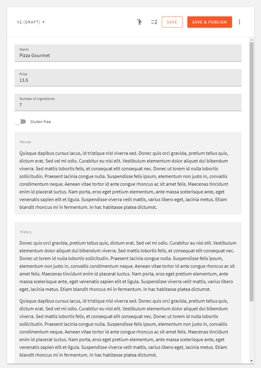
Here’s what a default layout looks like:
 Default form layout
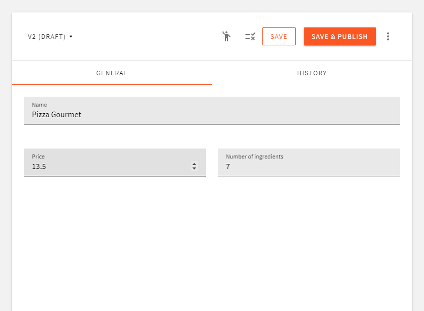
Once we import the plugin and register it in our admin app, we get our custom layout:
 Custom form layout
You can see the Recipe tab is hidden. That’s because we don’t have the necessary permission to view it.
Custom UI Elements
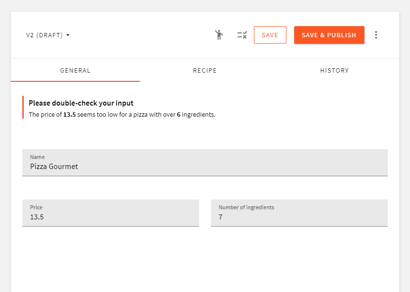
Using form data you can also render other UI elements, or even show/hide fields depending on the value of some other field. In the following example, we show a warning if the price is less than 20 and number of ingredients is greater than 6:
import React from 'react'import { CmsContentFormRendererPlugin } from '@webiny/app-headless-cms/types'import { Alert } from '@webiny/ui/Alert'import { Grid, Cell } from '@webiny/ui/Grid'import { Tabs, Tab } from '@webiny/ui/Tabs'import { useSecurity } from '@webiny/app-security'
const PizzaLayout = ({ fields, data }) => {const { identity } = useSecurity()const bakeryPermission = identity.getPermission('bakery')const canEditRecipe = true //bakeryPermission && bakeryPermission.canEditRecipe === true;
const priceTooLow = data.price < 20 && data.numberOfIngredients > 6
return (  <Tabs>    <Tab label="General">      {priceTooLow && (        <Grid>          <Cell span={12}>            <Alert type={'warning'} title={'Please double-check your input'}>              The price of <strong>{data.price}</strong> seems too low for a pizza with over{' '}              <strong>6</strong> ingredients.            </Alert>          </Cell>        </Grid>      )}      <Grid>        <Cell span={12}>{fields.name}</Cell>      </Grid>      <Grid>        <Cell span={6}>{fields.price}</Cell>        <Cell span={6}>{fields.numberOfIngredients}</Cell>      </Grid>    </Tab>    {canEditRecipe && (      <Tab label="Recipe">        <Grid>          <Cell span={12}>{fields.recipe}</Cell>        </Grid>      </Tab>    )}    <Tab label="History">      <Grid>        <Cell span={12}>{fields.history}</Cell>      </Grid>    </Tab>  </Tabs>)}
export default (): CmsContentFormRendererPlugin => ({type: 'cms-content-form-renderer',modelId: 'pizza',render(props) {  return <PizzaLayout {...props} />},})
Using this approach, you can add a nice touch to your UI and guide the content editor with additional logic, validate the input, and add other helpful elements which would otherwise be really difficult to define on the content model itself:
 Custom UI elements