Introduction
How theming works inside Webiny Page Builder.
- what does the Page Builder theme consist of
- what plugins are used in Page Builder theme
Overview
By default, every Webiny project includes the default website theme which defines different visual aspects of your website, for example the default set of colors, typography, the default page layout, and more.
In a new Webiny project, if we were to open the apps/theme folder and in it the apps/theme/index.ts file, we’d see the following:
import { PbPageLayoutPlugin } from "@webiny/app-page-builder";
import { FbFormLayoutPlugin } from "@webiny/app-form-builder";
import { ThemePlugin } from "@webiny/app-website";

// The central theme object which defines different visual aspects of your website,
// for example the default set of colors, typography, breakpoints, and more.
import theme from "./theme";

// Default layouts used by Page Builder pages and Form Builder forms.
import StaticLayout from "./layouts/pages/Static";
import DefaultFormLayout from "./layouts/forms/DefaultFormLayout";

// Ultimately, theme and layouts need to be registered via their respective plugins.
// To learn more, see: https://www.webiny.com/docs/page-builder/theming/introduction.
export default () => [
    new ThemePlugin(theme),

    new PbPageLayoutPlugin({
        name: "static",
        title: "Static page",
        component: StaticLayout
    }),

    new FbFormLayoutPlugin({
        name: "default",
        title: "Default form layout",
        component: DefaultFormLayout
    })
];
Respectively, via the ThemePlugin, PbPageLayoutPlugin, and FbFormLayoutPlugin plugins, the file achieves the following:
- registers the central theme object
- registers the Static page layout, to be used with pages created with the Page Builder application
- registers the Default form layout layout, to be used with forms created with the Form Builder application
Theme Object
As mentioned, the theme object defines different visual aspects of our website, for example the default set of colors, typography, breakpoints, and more.
Apart from being used in the code by different page elements, the theme object is also integrated with different editors that are available in the Page Builder’s application, like page or block editor. In other words, colors or different typography options defined in the theme object are automatically picked up by these editors, enabling users to select them while building content and ensure everything stays visually consistent.
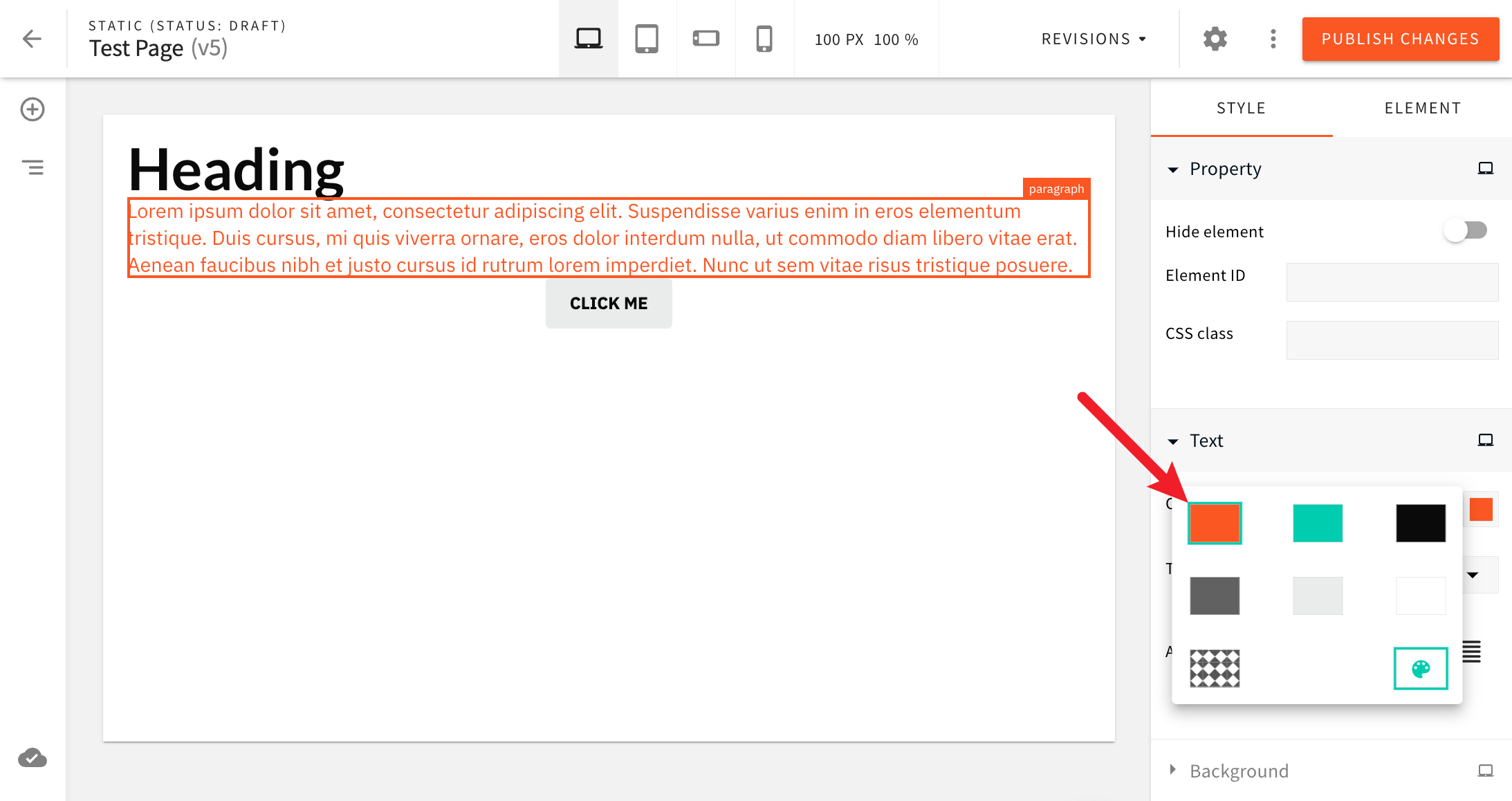 Theme Colors
By default, the theme object is exported from the apps/theme/index.ts file, and it looks like the following:
// Parts of code removed for brevity.
import { createTheme } from "@webiny/app-theme";
import { CSSObject } from "@emotion/react";

// Breakpoints (desktop, tablet, mobile).
export const breakpoints = {
    desktop: "@media (max-width: 4000px)",
    tablet: "@media (max-width: 991px)",
    "mobile-landscape": "@media (max-width: 767px)",
    "mobile-portrait": "@media (max-width: 478px)"
};

// Colors.
export const colors = {
    color1: "#fa5723", // Primary.
    color2: "#00ccb0", // Secondary.
    color3: "#0a0a0a", // Text primary.
    color4: "#616161", // Text secondary.
    color5: "#eaecec", // Background.
    color6: "#ffffff" // White background.
};

// Fonts.
export const fonts = {
    font1: "'IBM Plex Sans', sans-serif;", // Primary.
    font2: "'Lato', sans-serif;" // Secondary.
};

// Border radius.
export const borderRadius = 4;

// Typography.
const headings = {
    fontFamily: fonts.font2,
    color: colors.color3,
    WebkitFontSmoothing: "antialiased"
};

const paragraphs = {
    fontFamily: fonts.font1,
    color: colors.color3,
    fontWeight: 400,
    lineHeight: 1.35,
    WebkitFontSmoothing: "antialiased"
};

export const typography = {
    heading1: { ...headings, fontWeight: "bold", fontSize: 48 },
    heading2: { ...headings, fontSize: 36 },
    heading3: { ...headings, fontSize: 30 },
    heading4: { ...headings, fontSize: 24 },
    heading5: { ...headings, fontSize: 20 },
    heading6: { ...headings, fontSize: 18, lineHeight: "1.75rem" },
    paragraph1: { ...paragraphs, fontSize: 16.5 },
    paragraph2: {
        ...paragraphs,
        fontSize: 12.5,
        letterSpacing: "0.45px",
        lineHeight: "19px"
    },
    quote: {
        ...paragraphs,
        fontWeight: "bold",
        fontSize: 22
    },
    list: { ...paragraphs, fontSize: 17 }
} as const;

// Buttons.
const buttons = (overrides: CSSObject) => ({
   // Code removed for brevity.
});

// Theme object.
const theme = createTheme({
    breakpoints,
    styles: {
        colors,
        typography,
        elements: {
           // Code removed for brevity.
        }
    }
});

export default theme;
In the following text, we cover all the different properties of which the theme object consists of.
Breakpoints
Via the breakpoints property, the theme object defines four available breakpoints:
- desktop
- tablet
- mobile (landscape orientation)
- mobile (portrait orientation)
Note that the property names of these breakpoints (desktop, tablet, mobile-landscape, mobile-portrait) should not be changed. But, the assigned media queries can be adjusted and new ones can be introduced, if need be.
Colors
Via the styles.colors object, the theme object defines theme colors, where property names represent the IDs of colors and values respective color codes.
The IDs of colors don’t follow any naming convention. Upon introducing new colors, IDs like primaryColor or myCustomColor will work as well.
Typography
Via the styles.typography object, the theme object defines theme typography, where property names represent the IDs of typography rules and values respective CSS rules that define them visually.
Like with colors, typography IDs don’t follow any naming convention. Upon introducing new typography, IDs like primaryTypography or myCustomTypography will work as well.
Page Elements
Respectively, the styles.elements object enables defining and overriding styles for new and existing page elements. Like with colors and typography, property names represent the IDs of page elements, and values respective CSS rules that define them visually.
By default, the property contains styles for default document, quote, button and list page elements, but note that styles for custom ones can be added here as well.
Page Layouts
Ultimately, all pages created with Page Builder’s page editor are rendered within a page layout.
For example, the Static page layout (by default included in every Webiny project) renders all pages in a pretty standard header → content → footer structure.
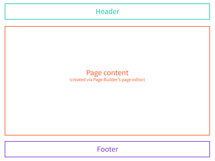 Static Page Layout
In the Page Builder, you can have multiple layouts. For example, one layout where the page is rendered in two-columned, the other in three columned layout.
Here is an example of how to register a layout:
import StaticLayout from "./layouts/Static";


(...)


{

    name: "pb-page-layout-static",

    type: "pb-page-layout",

    layout: {

        name: "static",

        title: "Static page",

        component: StaticLayout

    }

} as PbPageLayoutPlugin
Each layout has the following attributes:
name- an internal identifier for that particular layouttype- plugin type, must be set topb-page-layoutlayout- an object containing the layoutname,title, and a Reactcomponentused to render the layout
To introduce multiple layouts all you need to do is register multiple pb-page-layout plugins.
It’s also quite easy to register a new layout into the default theme:
// Some code is removed for the sake of brevity.

import { plugins } from "@webiny/plugins";

import CustomLayout from "../custom-layout";


plugins.register([

  // (...)

  {

    name: "pb-page-layout-my-custom-layout",

    type: "pb-page-layout",

    layout: {

      name: "my-custom-layout",

      title: "My layout",

      component: CustomLayout

    }

  }

  // (...)

]);
After saving the change, your newly registered layout should appear in the Categories form, in the Page Builder application as shown below:
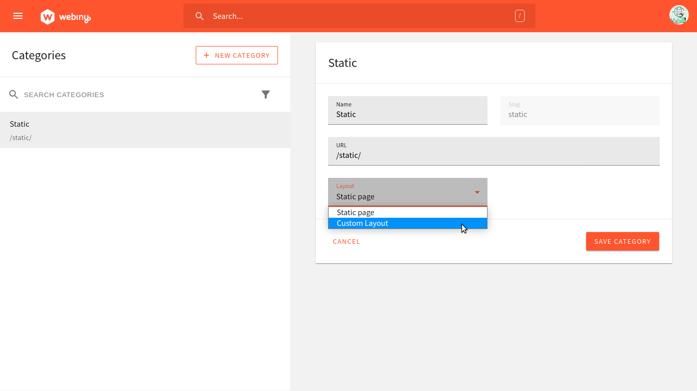 New custom layout
In the Page Builder, layouts are linked to page categories. When you create a page category, say “Blog”, you need to select a layout.
Each page created inside the “Blog” category, by default, use that layout. However, inside the page settings, you can overwrite that on a per-page basis if you need to.
FAQ
Should i adjust the theme directly or make a copy?
How to enable multi theme?
Can I use “ css instead of objects?